Townhouses with character
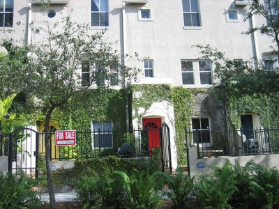
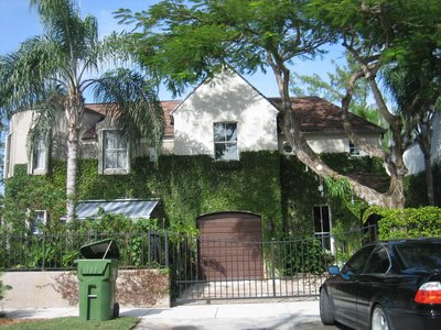
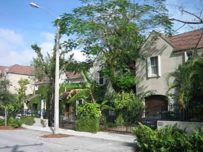
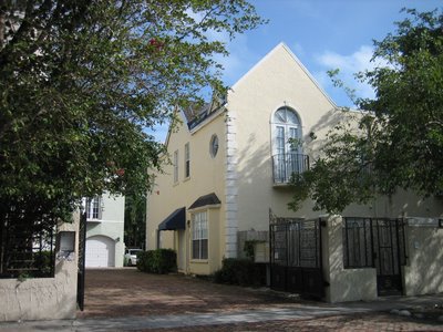
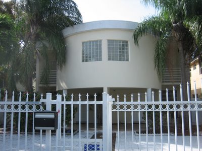
 Here below is even a round one that someone mentioned in a previous post.
YOU MAY NOT LIFT THE PHOTOS & TEXT. IT'S COPYRIGHTED INTELLECTUAL PROPERTY. YOU CAN HOWEVER SHARE A STORY ON SOCIAL MEDIA BY USING THE LINKS HERE.
For linking to this one story, just click on the time it was posted & just this story will open for sharing - only through social media. Not copying and pasting.

6 Comments:
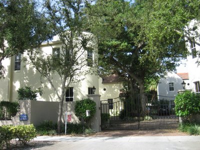
I recognize the first pic because those are some of my favorite in the Grove. However, like I stated in my post, that top place is built on a huge lot with many others of its kind that start at Virginia and wrap around Jackson Ave. So, there was plenty of room for creativity. Plus, that is really the outskirts of center grove on the busy street know as Bird Rd which is a little more "city-like" (I dont want to say "urban" because it isnt urban, but hopefully you get what Im trying to say) and those Bostonian looking residences look good there because there isnt much tree cover for them to tower over. As for the other pics you took here, with the exception of the one with the rounded piece jutting out, they all look similar and were built on larger plots of land. 3/5 have ivy and look very similar. I will agree with you that they are much more appealing to the eye, but again, I think that the other homes are more limited by land.
Why do you bother, Grapevine? Once someone has a block in their brain like the Blind one here, you can't get your point across.
I agree, the bottom pictures are crap. We don't need more crap in the Grove. There is no reason why a developer cannot use some creativity even if the land area is small. Blind Mind makes no sense at all. Big or small, crap is crap.
The first few photos are of the French Villas and Parisian Villas on Virginia and Jackson; they were built by Carlos Rua who should stick to building townhomes and not the 27th Avenue Metrorail project.
I think the top photos represent R-3 Zoning or possibly are the result of a now-banned PUD (Planned Unit Development. Somehow, the increased density seems to work.... and the appear much more approriate than the R-2 zoning 'mini mcmansion duplexes'....
It shows that density is not always a BAD thing!
Except for the bottom one, with the round room and the glass block, these are not that original either. Better than the bottom ones... which is not hard, but not that great either.
Hey, Im not looking for people to agree with me. Just providing my $0.02 on the topic. Thats what a comment box on a blog is for, no? I think that there are much bigger fish to fry in the Grove, so I am fine with the way the new developments look. Thanks to the above poster for noting that the other developments pictured are cookie cutter as well, even if they are of a nicer design. Why not focus on issues like transportation, power lines (should be underground in the Grove), government incompetence, complacency (see post on Haskins and comments), etc.? Once all of those major issues are tackled, I'll be happy to hop on the housing design complain train. Until then, they look fine to me.
Merry Christmas to all and to all a good night!
Post a Comment
<< Home